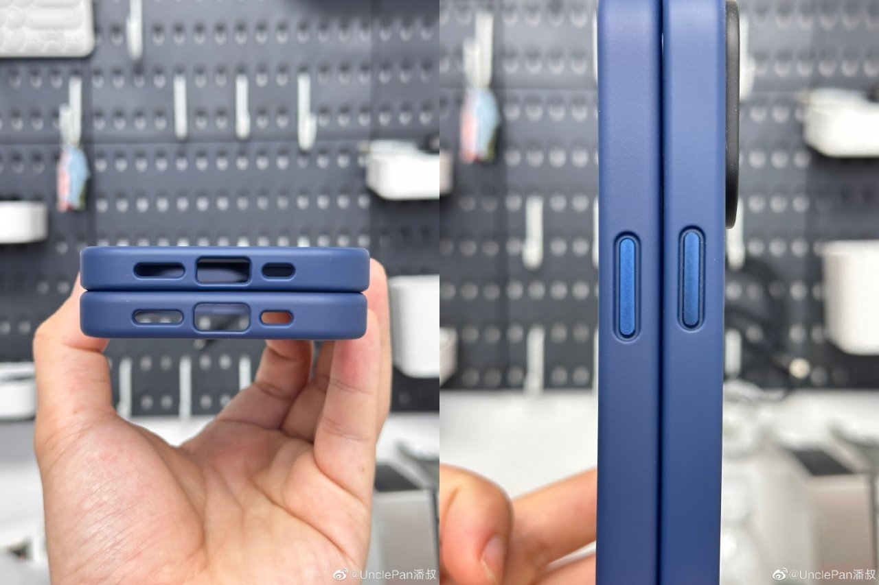
Newly leaked images and a video purportedly of a case for the forthcoming iPhone 15 Pro appear to show many very small alterations to the size and position of controls.
Previous on and off again rumors have suggested that Apple is looking at the type and position of iPhone controls, such as the volume button. Now a new leak comparing iPhone 15 Pro cases to those of the iPhone 14 Pro show a series of minute differences.

If correct, the leaked cases show a slightly larger microphone cutout, and a fractionally repositioned sleep/wake control
As first shown on Chinese social media site Weibo, a series of images compared the alleged iPhone 15 Pro case to its predecessor. The most immediately significant difference concerns what was called the mute switch, and may now become an "Action" button.
The cutout for the button is noticeably smaller than that for the old switch. That would fit the claim of Apple changing to a button since that would need to only be pressed, not slid to one side or the other as at present.
While that cutout is smaller than the current equivalent, the leaked images appear to show the the one for the bottom charging connector is larger. That also fits the expectation that Apple will switch from Lightning to USB-C for the iPhone 15 Pro.
It appears that the sleep/wake button, and the volume buttons, are the same size as before, but positioned fractionally lower down the side of the chassis.
Alongside the Weibo images first spotted by MacRumors, Twitter user "Majin Bu" has leaked what purports to be a video of iPhone 15 Pro cases.
iPhone 15 Pro Max Case #apple #iphone #iphone15promax pic.twitter.com/DfRuoXWNiL
— Majin Bu (@MajinBuOfficial) June 24, 2023
The most significant difference revealed in this video is that it appears that the iPhone 15 Pro will feature a slightly larger microphone grill, and also that the camera section will be bigger as well.
Apple is expected to launch the iPhone 15 Pro in September, alongside the rest of the new iPhone 15 range.


