Apple began with Steve Jobs and Steve Wozniak marketing primarily at trade shows, and now the iPhone has made it $4 trillion firm with ubiquitous advertising. But throughout, Apple has used sometimes terrible branding to sell us all on its products.
Today you know that every smart strapline like "thinpossible" or "Awe Dropping" has been user-tested, surgically examined by committees, and only put out when Apple is certain it's the greatest thing ever. That's far from unreasonable or even unusual, but it's a striking difference to how it used to be — and even to how the entire name of the company was chosen.
This is a case of where you can pick from at least a handful of origin stories, usually involving Steve Jobs driving by an apple orchard. Or maybe living on one.
Or according to a June 1983 issue of Apple Orchard, Jobs and Steve Wozniak chose it when applying for their business license at the local registry office. That office was due to close at 5pm and the story goes that at 4:59pm, they still didn't have one.
"They found that their favorites had already been taken," writes Ransom S. Fields. "[But] because Jobs was on a fruit diet, and was eating an apple, the rest is history."
Actually the rest is corporate branding that has now lasted for fifty years. Not very many firms last that long, and incredibly few have a universally recognizable brand identity of the kind firms like Apple and Nike do.
You can't ever predict success, but even if you are lucky with something taking off, it takes effort to keep it going. We may never know how much Apple spends on its logos and other branding, but it is a lot — and it is neverending.
If it weren't, we wouldn't just have had the company commission a new logo for Apple TV. Let alone have the firm insist on that logo being filmed in a studio instead of created digitally.
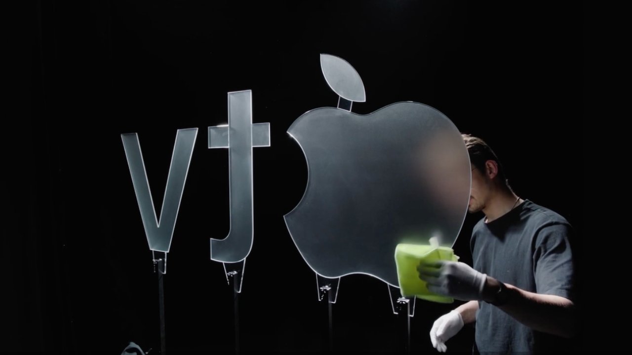
Getting the glass Apple TV logo ready for filming — image credit: AdAge
Just as Woz and Jobs surely never imagined their company would some day make "Slow Horses," the whole idea of corporate identity is unlikely to have been foremost on their mind.
And if it had been, Apple Computer probably wouldn't have got the first logo that it did. A logo that instead of a snappy marketing phrase, instead said: "Newton... A mind forever voyaging through strange seas of thought alone."
That's paraphrased from William Wordsworth's "The Prelude," written in 1850, or 126 years before Apple existed.
Whimsical California
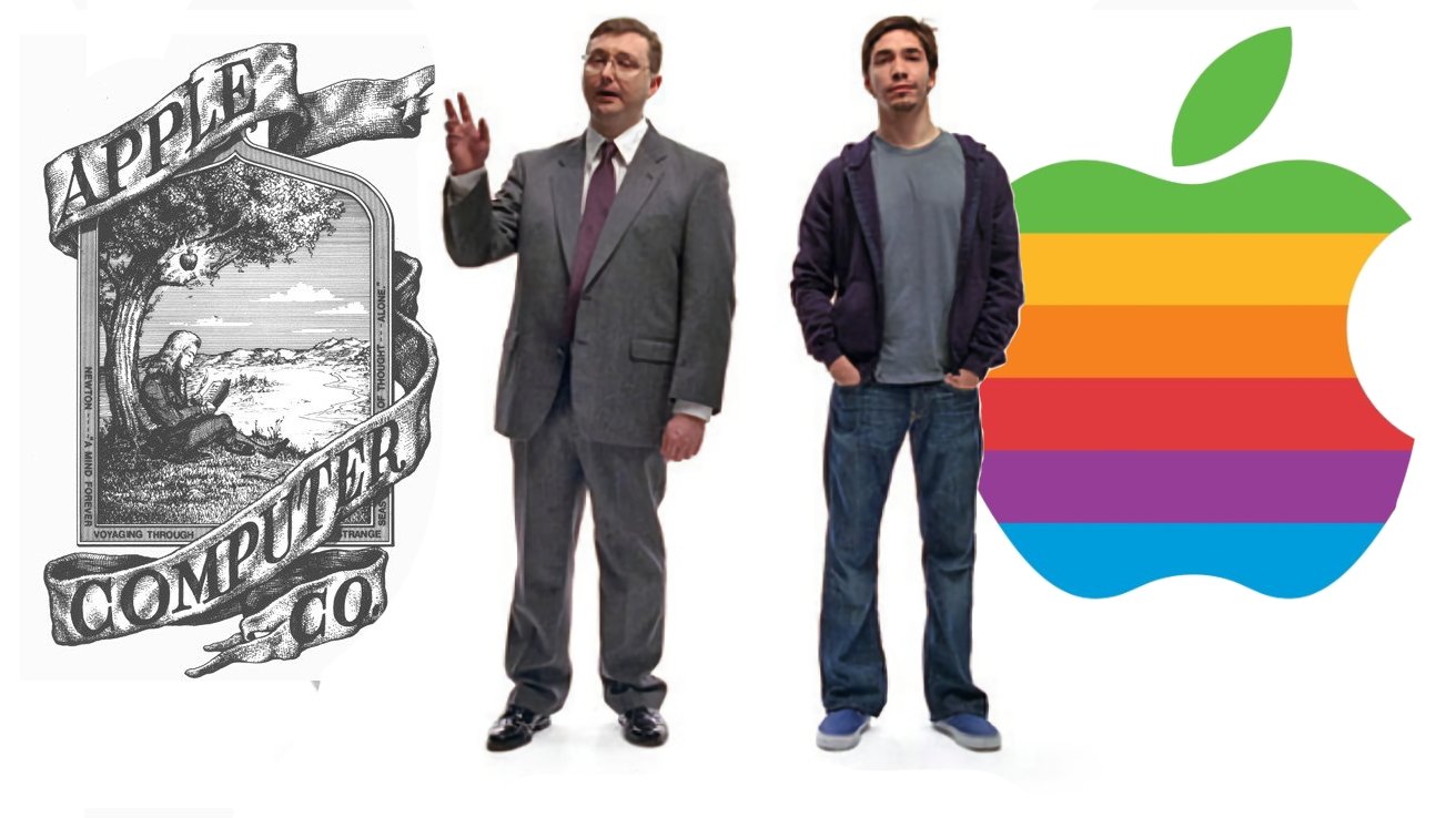
Steve Jobs may always have been the businessman, and Steve Wozniak the hippy dreamer, but they also had Ronald Wayne with them. He designed an intensely intricate Apple logo which was more like a 1800s woodcut illustration than a brand — and he knew it.
"I knew at the time it was not a legit 20th century logo, it was a 19th century logo, but it was fun," he told Motherboard in 2017. "Everything we did in the beginning was for fun."
Picture this on the startup screen of an Apple Watch. This is the original Apple logo — image credit: Ronald Wayne for Apple
"Jobs insisted on the word Apple, and I made the connection to Newton's apple," he continued. "I was trying to capture Newton and the apple, all [of a] sudden, a great idea is born."
"I knew I was standing in the shadow of giants with these kids [and] I was 20 years older than them," he said. And then those kids got rid of his logo.
Wayne's woodcut logo lasted about a year, and was replaced by the famous six-colors Apple icon with a bite taken out of it. That was designed by Rob Janoff, commissioned by Steve Jobs, and his work is on every Apple device to this day.
"It was very simple really," Janoff said in 2011 to the Revert to Saved website. "I just bought a bunch of apples, put them in a bowl, and drew them for a week or so to simplify the shape."
"I didn't have much of a formal brief on the logo assignment, other than 'don't make it cute'," he continued. "But I did know the selling points of the Apple Computer [at that time], and one of the biggest was colour capability."
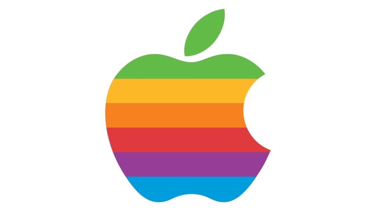
Apple's famous six-color logo, designed by Rob Janoff — image credit: Apple
"To me, that looked like colour bars on a monitor, which became the stripes in the logo," he said. "The order of the stripes, I'm sorry to say, had no particular grand plan other than I liked them that way."
It's not known how much Janoff was paid, and it is incalculable how expensive this particular logo would prove over the next many years. Because at the time, it was supremely expensive to print six colors, and especially to have them without any gaps to allow for printing registration errors.
This is why Michael Scott, Apple Computer CEO from 1977 to 1981, called it "the most expensive bloody logo ever designed."
Macintosh branding
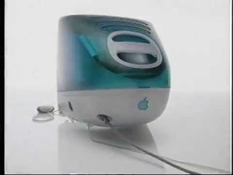
The six colors logo was specifically designed in time to be used for the launch of the Apple II in April 1977, but of course within a few years it was the symbol of the Macintosh.
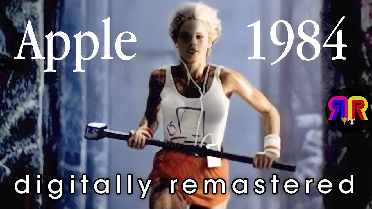
We've spoken and are going to speak about the "1984" ad at some length. It's not really something we need to delve deeply into here, beyond posting the video.
Not every ad gets a 4K AI remaster by fans. We can't imagine McDonalds "Mac The Knife" campaign from about the same time getting one. Ridley Scott's ad for Apple has.
By the time the Mac finally launched in 1984, John Sculley was Apple Computer CEO. He spent so much money on advertising it — around $78 million then, or $212 million in 2025 — that the price of the machine had to rise.
Now the advertising had to surmount the problem that the Mac was even more expensive than it was intended to be. So Sculley implemented the "Test Drive a Mac" campaign.

The idea was that people could borrow a Mac for a time, for free. They would then be so enamored of it that they would buy one.
It was a terrible idea. Dealers shouldered the price of the campaign for the most part, and took substantial financial hits for it.
One of the authors of this piece was working as a teenager at an Apple dealership during the "Test Drive" campaign. We can absolutely confirm that the users who did this abused the machines, used them as free rentals when they already had a machine, and so forth.
For the folks that used the program as intended, they did take that test drive too. Whether they liked it or not, the price was still too high.
It was an advertising flop, and a very expensive one.
Power Mac mixed messaging
In 1994, Apple made its second platform migration. The first was Apple II to Mac arguably in 1990 six years after the "Apple II Forever" conference at the Moscone Center in 1984, and the second was 68K Macs to PowerPC.

The early TV spots for PowerPC Macs used "the future is better than you expected," as a tagline, discussing technical matters like networking, and curiously, the NuBus add-on PC Card that allowed users to run DOS software. It didn't pair well with the simultaneous "This future belongs to the past" campaign.
The company retained "it does more, it costs less, it's that simple" that started in about 1988, through 1994. That was never quite true as far as costs compared to DOS machines of the age.
And Apple tried to return advertising to the Super Bowl. It was a very bad and surreal ad, loosely associated with the "future belongs to the past" tagline.
That too wasn't that successful, and is incredibly poorly archived. And it was followed up by an even worse branding exercise.
The Performa dark days
Along the way, Apple decided the mass market was the best place to sell their boutique computers, that were by the day losing marketshare to the more generic PC architecture.
It worked for the Apple II family to some extent. Apple must have assumed that the rules were the same a decade after those legendary machines sold in Lechmere, and other big-box retailers of the early-eighties.
So, in 1992, the mass-market Performa line launched. Apple's branding was confusing.
There were a series of ads, poorly archived, featuring the fictional "Martinelli family," the Reardon residence, and "Lawrence Associates" extolling the virtues of the consumer Mac, the Performa. They were scatter-shot, not produced well, and confusing.
They were common in the wee hours of the morning after programming and before the sign-off anthem. They often ran a half hour or more. They were not well received.
Along with the ad campaign, Apple absolutely flooded the market with Performa SKUs. Confusingly, there were multiple versions of the same unit, with model numbers varying by just a few digits.
For instance, in late 1994, the Performa version of the Power Mac 6100 had six SKUs — the 6110, 6112, 6115, 6116, 6117, and 6118. Apple marketing and store staff dealing with consumers struggled to differentiate the models.
And at the time, Apple very poorly estimated demand for the Performa — while at the same time, underestimating the need for stock for the professional models.
They were sold in Sears, CompUSA, Kmart, Service Merchandise, and so many more places whose buildings are now hermit crab shells for other businesses. And for the most part, they were poorly maintained by the store staff.
The Performa is one of the first things that was killed when Jobs returned. It was exterminated in 1997, with a dozen Performa lines killed overnight. The Power Mac was cut down to six models at the time too.
It was so important to Apple — specifically Jobs — to do this, that Performa branding and marketing was killed simultaneously with the Apple clone licensing.
We're pretty sure that Apple would like the marketing from that day erased from the internet. It was bad then, and it has since aged like milk.
Six-color to solid
And, in the middle of all this, with Steve Jobs's return, Apple started retiring the six-color Apple logo with a monochrome one.
In 1998, the expensive-to-print six color logo was replaced with several single-color models. At the time, Apple had a brand guideline that it released to dealers discussing it.
That guide was very clear on how to — and how not to — use the logo. It had very specific guidelines, under pain of losing Apple authorization, on how to use it, how to design with it, how to color it, and other strict typography requirements.
It wasn't all that different when compared to today's version.
That was just the start, though. Two more campaigns that were more impactful to Apple than even "1984" were about to launch.
Jobs is back with Think Different
When Jobs returned to Apple, he also looked at branding and marketing. Under his instruction, Apple launched branding that would be far more effective than the test drive.
It was the incredibly popular 1998 "Think Different" campaign, which in some forms is still referred to by Apple.
The campaign, with permission, used generally black and white pictures of celebs and politicians in print advertising and in video on TV and at Apple events. It debuted "The Crazy Ones" speech, narrated by Richard Dreyfuss at first. A follow-up was narrated by Jobs, which pops up from time to time.
While there is a shorter TV version of the promo, this is the Steve Jobs narrated one, which is a full minute long.
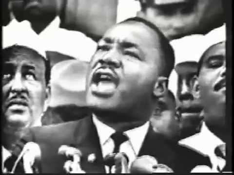
For a time, the "Think Different" campaign had posters as ads in its stores, and frequently in magazines. Posters were briefly available for purchase online featuring Jim Henson, Gandhi, Pablo Picasso, Bob Dylan, Thomas Edison and so many more celebs, inventors, scientists, and artists. Some of them are fetching big bucks now, over a quarter of a century later.
"Think different" was the renaissance of Apple marketing. The campaign was a loud and enormous victory for Apple, Jobs, and long-time ad partner TBWA\Chiat\Day.
And, it was so popular and emotive, that it was played inside Apple during the Jobs memorial, following his passing.
"There is no step three!"
Jobs also instigated the use of Jeff Goldblum in television spots for the iMac.
One of the commercials had an ending line, that persists from time to time. Famously, when talking about connecting the iMac to the internet, the video enumerates the steps to do so, with no step three, in an age when the internet wasn't as ubiquitous or as easy to get on as it is now.
Goldblum also did the "Un-PC" ad which stuck with the authors of this piece for years. The video below is just about all of Goldblum's ads, but we remember two or three more, beyond these.
Overall, the campaign was well-received. The iMac was a great success, and the name persists to this day.
Less Mac, more iPod
But then around 2003, these two campaigns were out and the dancing silhouette iPod ads were in.
This marked one subtle, not to say extremely slight, difference in Apple branding. The silhouetted dancers all wore white earbuds connected to iPods.
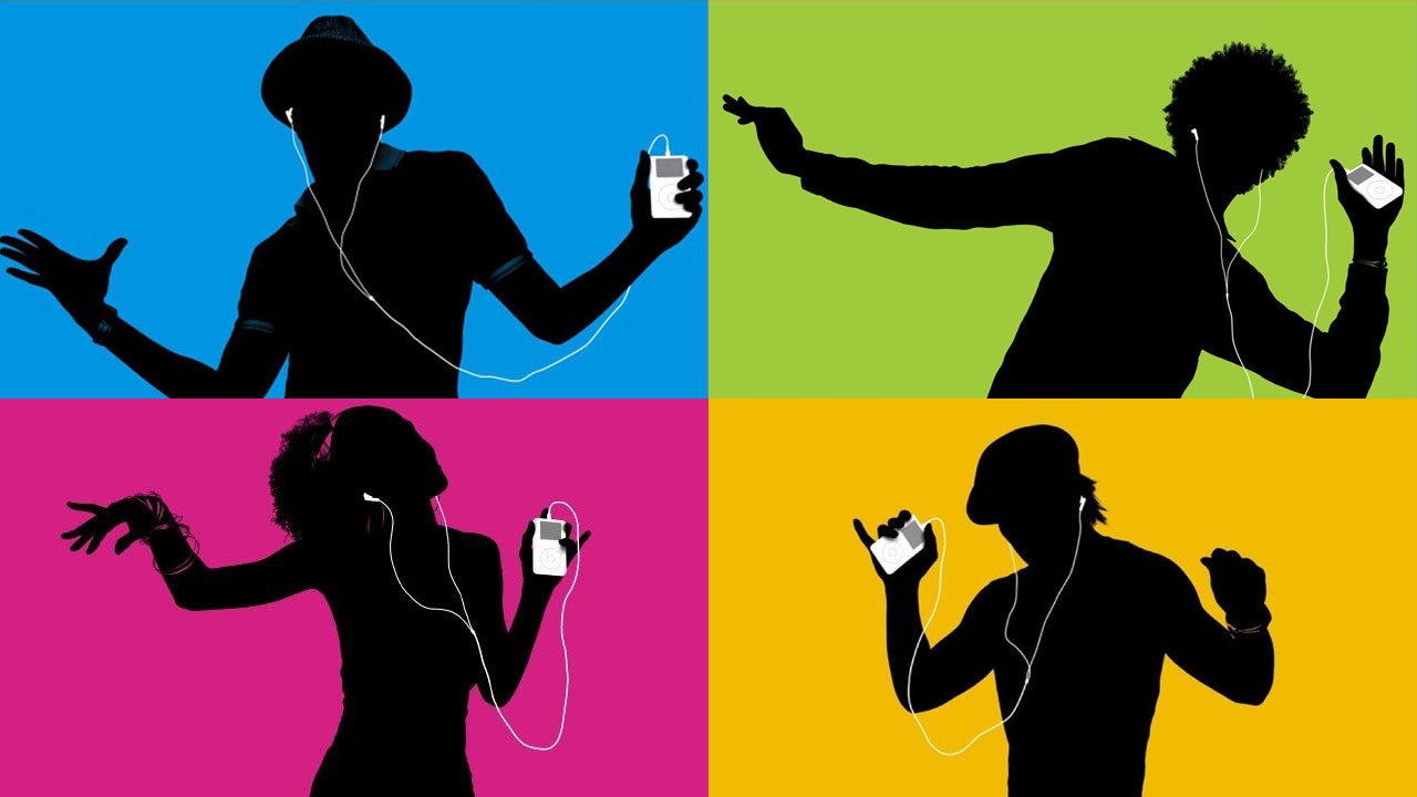
Dancing iPods
So while it was subtle compared to the positioning of the Mac in the Jeff Goldblum ads, the iPods and their increasingly iconic headphones were clearly present. And it was a case of life promoting art, as those white earbuds became a common sight around the world.
The impact of the ad was immediate. It was frequently parodied, which only ended up giving Apple more brand awareness beyond that company that folks dismissed as being the colored computer company.
I'm a Mac
Apple is one of the few companies that would ever consider not showing off their product in their ad. But still, Apple keeps doing this and it never hurt sales at all.
For instance, from 2006, the next branding job saw the personification of a Mac — but still no product shot. In a campaign called "Get a Mac," actor Justin Long claimed to be one. John Hodgman claimed to be a PC.
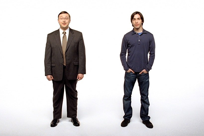
It was expressly created to promote the new Intel Mac line, and if you think you've seen all of the ads, think again. The team shot 323 ads and aired only the best 66.
Moving with the times
Perhaps the single biggest branding exercise Apple has made came toward the start of those "I'm a Mac, I'm a PC" ads. For in January 2007, Apple was about to undergo another sea change that would have the Mac take a back seat to the iPhone.
Steve Jobs noted at the very end of the iPhone launch that the company was now making that plus the Mac, the iPod, and the newly-announced Apple TV.

"And you know, the Mac is the only one that you really think of as a computer, right?" said Steve Jobs, CEO of Apple Computer, Inc. "And so we thought about this, and we thought, you know, maybe our name should reflect this a little bit more than it does."
"So we're announcing today," he continued, "we're dropping 'computer' from our name. And from this day forward, we're going to be known as Apple, Incorporated."
In this name change, and in the launch of the iPhone alongside it, Apple took another step away from its woodcut, home hobbyist routes.
It's had new marketing ideas since then, such as the most recent campaign that celebrates all creatives — except for writers. It's had The Underdogs series of videos that showed Apple has funny if uncredited writers, while Microsoft simply does not.
Apple also has its now very long-running "Shot on iPhone." And it still uses a balance of internal PR people and external firm, TBWA\Media Arts Lab.
That firm is descended from Chiat/Day, the agency behind the introduction of the Macintosh and the famous "1984" ad.
So in many ways Apple thinks of — and plans — marketing in the same way it has for half a century. But it would never run the "I'm a Mac" ads now, it doesn't need to take shots at other vendors like it used to during the PowerPC days, and it would never put Ronald Wayne's woodcut logo on the back of an iPhone.
Apple's marketing has moved with the times. And Apple has grown up along the way.