Users cannot yet dig into the settings of the Apple Watch companion app that debuted in iOS 8.2, but one developer has cracked open the software to reveal what it will offer once an Apple Watch is connected to an iPhone.
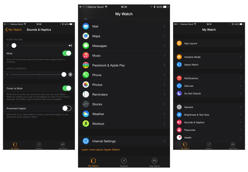
In a series of screenshots posted to his Twitter account on Friday, developer Hamza Sood revealed the controls that will be accessible in the Apple Watch app. Like the upcoming wrist-worn device, the companion app will feature a dark theme with black background and white text, making it a stark contrast from Apple's other iOS applications.
Under the main "My Watch" menu, settings include App Layout, AirPlane Mode, Notifications, Glances, Do Not Disturb, Brightness & Text Size, Sounds & Haptics, Passcode and Health. Further options exist for connectivity with iPhone apps like Mail, Maps, Messages, Music, Passbook, Phone, Reminders, and more.
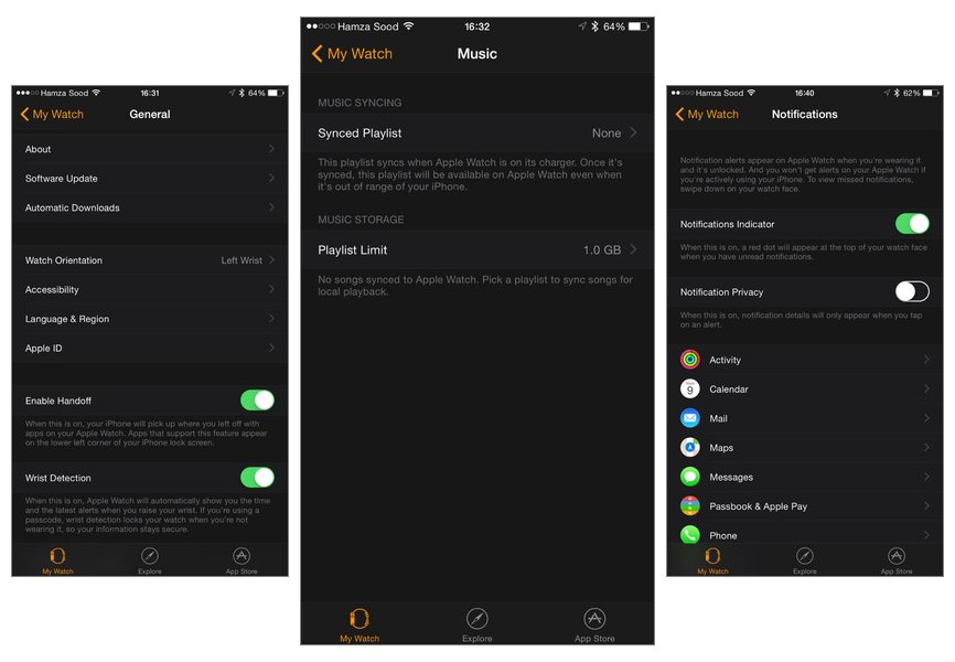
The General settings for the Apple Watch reveal that the device offers Handoff support, just as the rest of Apple's ecocystem of devices. Users can also turn off the "Wrist Detection" feature if they choose, disabling the screen's auto-on function when a user raises their wrist toward their face.
Under the Sounds & Haptics settings, users can change the strength of haptic feedback from the device. There's also a "Cover to Mute" option, which allows users to quickly silence their watch by covering the display with their hand. A "Prominent Haptic" option is also available for "common alerts."
Sood also noted that syncing playlists with the Apple Watch has a default 1-gigabyte limit, but users can expand it to 2 gigabytes. The Apple Watch is believed to have 8 gigabytes of onboard storage.
Apple has also included a "Notification Privacy" option, which will conceal details of a notification until the alert has been tapped. Users can choose whether or not push alerts from their iPhone are seen on their wrist.
Finally, a Monogram option allows users to create a one- to four-letter monogram that will appear as a complication on the "Color" watch face.
The highly customizable app was previously detailed by AppleInsider in February, though at the time, in a beta release of iOS 8.2, it had a much different look in line with traditional iOS apps.
Users found the Apple Watch app on their iPhone home screens after updating to iOS 8.2 beginning this week. At the moment, the application does not offer access to the settings without being paired with an Apple Watch.
The Apple Watch is set to become available on April 24 starting at $349. Preorders, and in-store hands-on opportunities, will begin two weeks earlier on April 10.
 AppleInsider Staff


-m.jpg)
 Malcolm Owen
 William Gallagher
 Andrew O'Hara
 Sponsored Content

 Amber Neely



36 Comments
I wish more apps, including the AppleInsider app, offered reverse type. So much easier on the eyes and battery.
I wish more apps, including the AppleInsider app, offered reverse type. So much easier on the eyes and battery.
Reverse type doesn't significantly improve battery life. After all, the backlight is still on. If you want to save battery life, turn down the overall brightness of your phone's screen.
I agree that reverse type may be more preferable to some from a legibility standpoint.
[quote name="elmoofo" url="/t/185227/finalized-apple-watch-ios-app-settings-dark-theme-shown-in-new-screens#post_2692024"]I wish more apps, including the AppleInsider app, offered reverse type. So much easier on the eyes and battery.[/quote] Agreed - darker themes in general would be welcome (Hated the all white or ridiculously bright trend ushered in with iOS7). However color of the screen matters not with LCD - the backlight is on no matter what is on screen. If Apple used an OLED display where power is only consumed if a pixel is lit, that would be different - but they don't. Probably because OLED is expensive, finicky and flaky even today, and probably couldn't be manufactured at Apple volumes yet. And lest you think I don't like the promise of OLED, I did get to see a 70" LG OLED display in Vegas during CES week (I was in Fry's where LG had a display - I didn't make it to the convention even though I was planning on it). That display was absolutely S T U N N I N G - even in the middle of a store with really, really crappy fluorescent ambient lighting. Then again I'm sure they were very careful about the video they were showing on it, but the blacks where simply amazing (more amazing given the really crappy environment the displays were in). Ultimate movie display easily besting my plasma I'm desperately hoping will have a long life now that plasma is all but dead :( Hopefully they fix the blue phosphor wearing out much more quickly than the other colors causing color shifting over time issues because at over $50K I want my display to last more than 5 years (!!)
Not even remotely true. You’re buying Google’s lies about Earth Day or whatever the heck it was.
Gimme a break. Reverse type requires less backlight in most situations to be readable. Less backlight requires less battery. I can read 2x as much iBook in reverse type with the brightness backed off to s comfortable level, vs. black type on a white background.