Apple has revamped the Apple Watch portion of its online store, bringing more on-screen information to help guide a new buyer.
Now if a potential buyer is interested in an Apple Watch Series 8, for instance, then they are taken through a newly revised process. It still ends up with the user having to choose the case material, the size, and so on, but the steps are now much more annotated with explanations.
"Let's start with material and finish," begins Apple in the Series 8 section. Where there is a choice, the choice is between Aluminum and Stainless Steel, and next to the latter, for instance, it says "polished finish with a durable sapphire crystal display."
There's also a new pop-up menu that gives much more detail about the differences. Alongside a general description of the finish and of the colors available, it also lists the specific weights and makes suggestions about why each should be chosen.
"[Aluminum is] great for everyday activities and high-speed workouts like running," it says, for example. "[Stainless Steel is] great for a more upscale look."
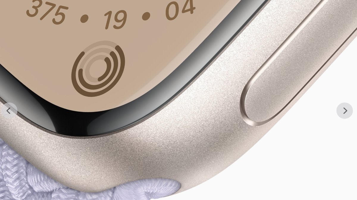
Apple has now also added to its photography on the site. Alongside the familiar front and angled views of Watches with straps, there is now one finely-shot closeup image showing a particular case material.
There are similar details and extra photography for every step of the buying process. Buyers can also scroll down to see all of the decisions they'll have to make, but only the current one is active, while each of the following ones is greyed-out.
Buyers can go back up to change any choice, but the intention is that they be stepped through each part in sequence. It has the effect of reducing what's potentially an overwhelming series of options, into a more manageable requirement to make one decision at a time.
It's clearer and it makes the choices more understandable. However, it rather skips the very first choice buyers have to make.
That choice is whether to go for the Apple Watch SE, Apple Watch Series 8, Apple Watch Ultra — or some previous editions like the Apple Watch Series 7. Apple's revamp does not help with that choice at all.
There is still a "Which Apple Watch is right for you?" section that is a short table listing significant specification differences — and which users have to scroll down the page to find. Then there is also a more detailed Compare All Models section. But that lists all Apple Watches back to Series 1 and is solely a specifications sheet with no new guidance or recommendations.
This revamp comes around two months before Apple is expected to launch the Apple Watch Series 9, and a second generation of the Apple Watch Ultra.
