A new version number and Liquid Glass are far from the only changes Apple brings in iOS 26, but the Siri delays haunt an otherwise excellent upgrade.
The fall brings with it the usual release of new iPhone models and a new operating system to go with it. For the annual iOS upgrade, there's the usual expectation of improvements to what is already a pretty solid and well-established software package.
The examination of iOS for fall 2025 is a bit different, and for a fairly unusual reason.
It's not a lack of new features, as Apple has certainly worked hard to include them this year. It's not even the name, which we will discuss in a moment.
This time around, Apple is trying to make the iOS updates actually exciting again.
The iOS 18 release was supposed to be massive and driven by Apple Intelligence. The promise of a new and intelligent Siri that knew when your mother would arrive at the airport by analyzing your messages and picking up on a ton of context clues in your personal data.
The release of iOs 18 didn't include that. Heck, it didn't even include Apple Intelligence, as the world had to wait another month for it to finally arrive in iOS 18.1.
The glacial rollout of Apple Intelligence features and the absolute failure to bring the promised virtual assistant upgrade have not really helped Apple's cause.
No matter how much you used Image Playground to remix your portrait or how you customized the appearance of your home screen, it was an average release.
One year later, Apple seems to have learned its lesson. Its WWDC presentation stuck to stuff it was likely to actually deliver to consumers, while trying to conveniently avoid the Siri-sized elephant standing on the coffee table.
It was an acceptance that it had screwed up with iOS 18, with Siri. It wasn't an admittance of failure, but it was an insistence that it could do better.
While we're still waiting on that whole Siri thing, Apple has pressed ahead to try and make everything else better.
iOS 26 review: That number
The first thing that needs to be talked about is the version number. It's not iOS 19 as users would typically expect, but iOS 26.
This is not a decision intended to confuse consumers, but one meant to help them.
Regular Apple watchers will have known about the company's version numbering being a little bit off when taking into account the entire ecosystem. While iOS and iPadOS were on version 18, watchOS was on version 11, and visionOS was on version 2.
There's also the whole thing about macOS being on version 10 for almost two decades before finally moving to version 11 in 2020.
The 2025 releases are known by the number 26. Not representing the year of release, but the year that it will be most used within.
This theoretically makes everything easier to remember, as the version number is the same generation across the board.
Admittedly, while this number system may feel a bit weird right now, it's more a play to assist users in the future. In a few years time, you will know that iOS 26 came out at the same time as macOS 26 or watchOS 26.
You're not going to have to strain yourself to remember the numerical difference between the iOS and watchOS versions.
It's a clever play by Apple. It's just not something that will really be beneficial until some time has passed.
iOS 26 review: Liquid Glass
When it comes to interface changes in iOS 26, the one Apple has heavily promoted is a material one. Referred to as Liquid Glass, it's a design aesthetic that uses the properties of glass in many ways.
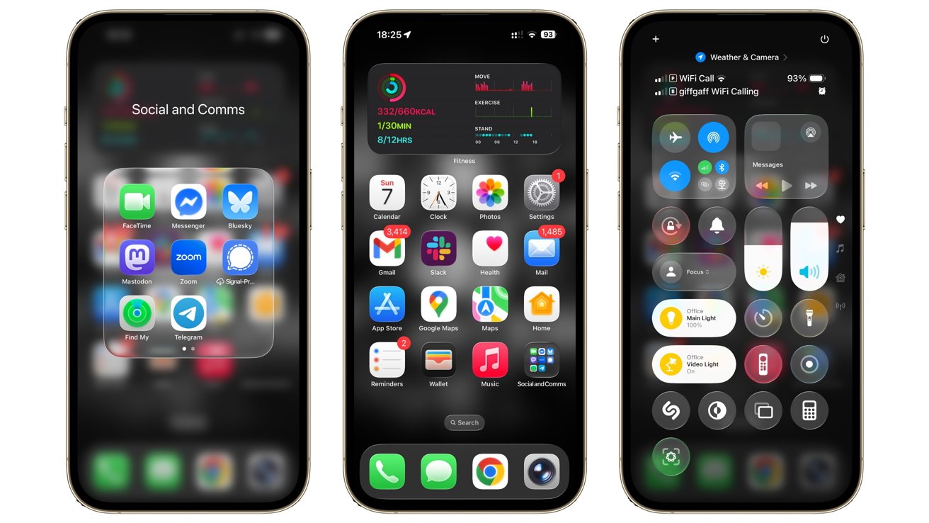
iOS 26 review: Liquid Glass on the Home Screen and Control Center
The intention, at least from Apple, is to have layers of glass on your home screen. Icons are intended to look like they were made with bits of colored glass, on a rounded glass square.
Folders containing your well-organized collections of app icons were also glass-like. Complete with a slightly frosted background and edges that look like the panels are reflecting a nearby light source.
Yes, you could also make all of the app icons appear to be clear if you really want to lean into the aesthetic.
This idea wasn't just limited to app icons, as the interfaces of Apple's first-party apps were also made to comply with the new design idea. App elements would include transparencies that could refract light from the background as it reached their edges in a pleasing manner.
Throughout the betas, it fixed issues such as how the many small buttons of Control Center were too transparent and refracted background elements a lot. It looked nice, but it introduced readability problems until some frosting was added.
It's an aesthetic that works well, and Apple has certainly worked hard to perfect it. Expect more tweaks in the future as Apple deals with the inevitable complaints, but it's landed in a good position for the operating system's release.
iOS 26 review: More personalization
The customization options in iOS 18 were considerable at the time. Back then, Apple laid a lot of groundwork, including allowing users to change the buttons on the Lock Screen, how icons could be placed on the Home Screen, and even app tinting.
For iOS 26, Apple hasn't really added that much more, but it's still a welcome mix.
As mentioned earlier, the previous options to turn icons into a Dark Mode or to tint them specific colors have been adjusted with Liquid Glass in mind. The previous Automatic icon in the Customize menu has been switched out for "Clear," which makes things a lot more transparent and greyscale in nature.
Mercifully, this isn't a full-blown glass effect on the icons, as they still all have to be readable. This appearance is also shared by Tinted, which is a kind of glass-ish remix of the previous appearance.
The menu also includes controls for icon size and whether titles are viewable, and if you're viewing icons in Light, Dark, or Auto modes. The Tinted color choice also includes a remixed dropper tool for making the icons match a color from your background.
The Home Screen has also become a bit more customizable than before.
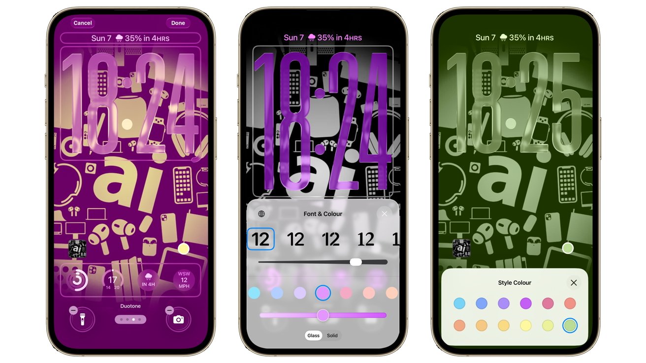
iOS 26 review: Liquid Glass has infiltrated the Lock Screen too
Again, Liquid Glass reappears here, with it applicable to the clock and other elements, though you can also set the clock to be a solid, flat color.
While you do have control over the font for the clock in various ways as usual, only one option adds in the ability to resize the clock itself. A grab handle in the bottom left corner of the clock section lets you stretch the numbers down the screen.
It's both beneficial for personalization and for timekeeping. It's hard not to read the time when the clock takes up half the screen.
One other bit of personalization is the wallpaper you can use. Sure, Apple's added some new dynamic wallpapers, but you can pull off some neat effects with your own images.
You can now set a photograph from your Photo library to be used as a Spatial Photo. The same conversion system is used to make 2D images more 3D for Apple Vision Pro users.
Here, it's a more practical change without needing high-priced headsets. Instead, you get a neat parallax effect when you move the iPhone around.
It's not the most groundbreaking change, but it certainly is a neat effect.
iOS 26 review: Camera and Photos
One of the things that Apple has done with Liquid Glass is to try and reframe how its apps function for users. It's had years of experience designing interfaces, but it's now trying to get the interface out of the way of a user's enjoyment of the app itself.
Two ways that this is evident is with the way users take photos and look at them afterwards.
The new Camera app reshuffles the interface to try and present users with the most pertinent information and options first. Yes, there are icons in view, but their positions are much better now.
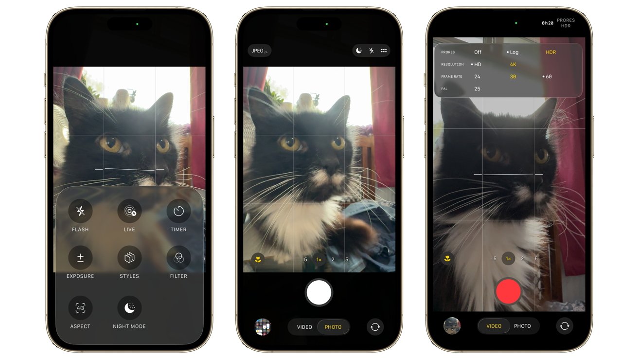
iOS 26 review: The Camera app's layout is more out of the way, but more useful.
Those different shooting modes in a row are moved from above the shutter to below the shutter button. Instead, you have quicker and easier access to magnification options.
The shooting modes are still available, but initially, you just see "Video" and "Photo" below the shutter. Touching this element lets you scroll to other modes, but it always presents the most-used options first.
In a nod to content creators, you're also getting a lot more options for managing your content before you actually shoot. You can more easily switch between JPEG and RAW in Photos, as well as adjust the resolution, right before you take the shot.
You could do this before, but the way it is presented is much better than in iOS 18. It's the same for video, as you can configure it to give you options for Log or HDR, resolution, and frame rate, much more flexibly than before.
It certainly saves users from having to delve into the Settings app to make changes. That said, you still have to go in there for some options.
The Photos app could be best described as a rethink for Apple away from the single-page approach of iOS 18. This time, instead of going up or down to access the full library grid or the Collections view, you tap the Liquid Glass toggle.
It's a partial reversion to what was used before iOS 18's updated app, but not a complete reversal. More of an intelligent tweak.
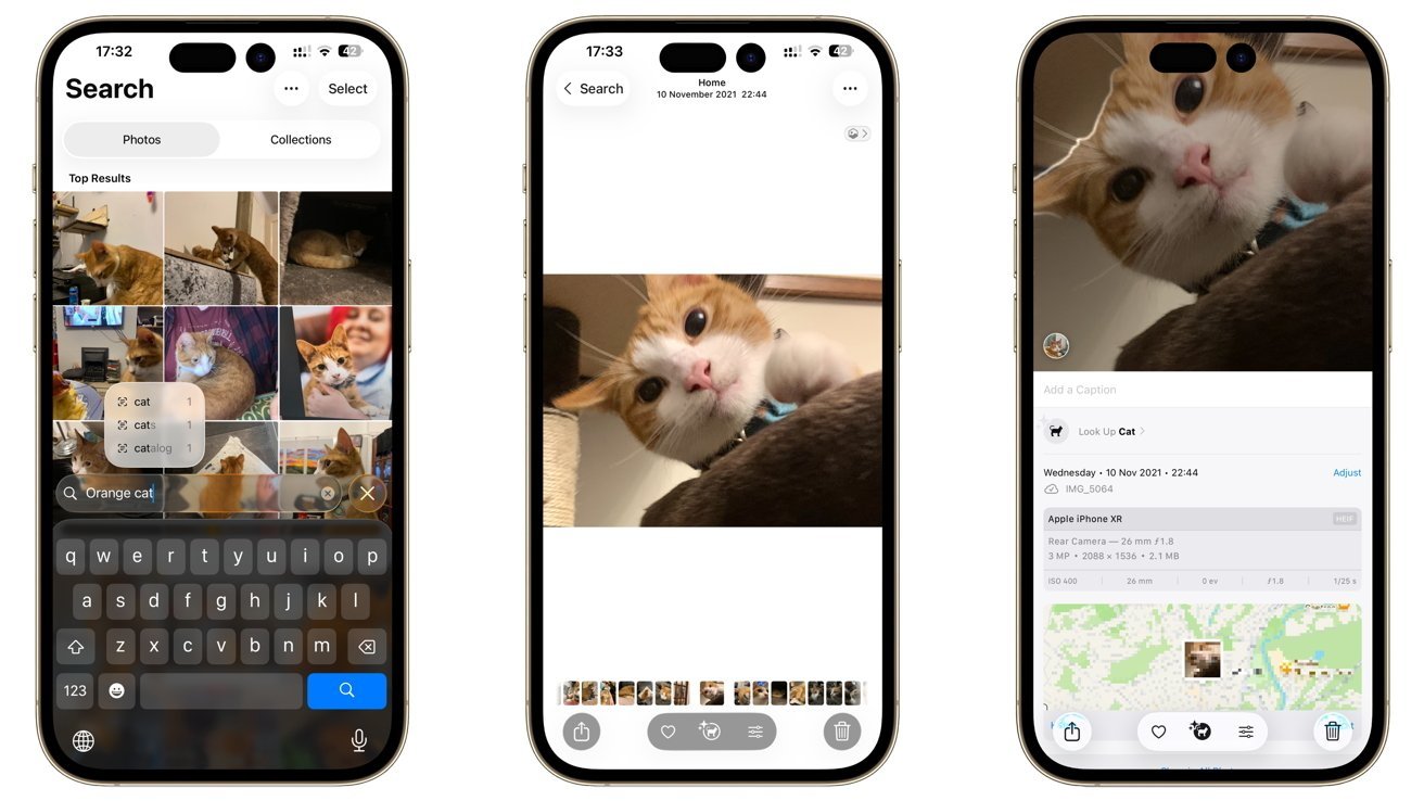
iOS 26 review: Photos is practically the same, with minor changes
When it comes to collections, Apple has tweaked the order to make Memories more prominent. Apple really wants to justify the use of Apple Intelligence, even if it means repeatedly urging users to try it out with their image collections.
The rest of Photos is pretty much the same as the 2024 update, with image editing largely unchanged.
Spatial Photos support is welcome here, even as a preview before using a shot in the Home Screen. Or before sending it to someone with pockets deep enough for an Apple Vision Pro.
Camera had big interface changes, while Photos intelligently tweaked what was there. In both cases, Apple's alterations have a big impact that will hopefully improve how people take photos with their iPhone.
iOS 26 review: Phone calls
One area that has probably been neglected by Apple for quite some time is the Phone app. Outside of smaller changes over its life, it's not really varied that much in recent years.
That's certainly not the case in iOS 26. Indeed, it's more useful than ever.
That starts with a new interface that goes well beyond a simple Liquid Glass glow-up. It's a complete change of layout.
The new unified layout divides the Phone app into Calls, Contacts, and Keypad, eliminating the Voicemail and Favorites tabs. Instead, you can have your favorite contacts shown above your recent activities in thumbnail form.
Of course, you can revert it back to the previous layout, but this unified format works very well.
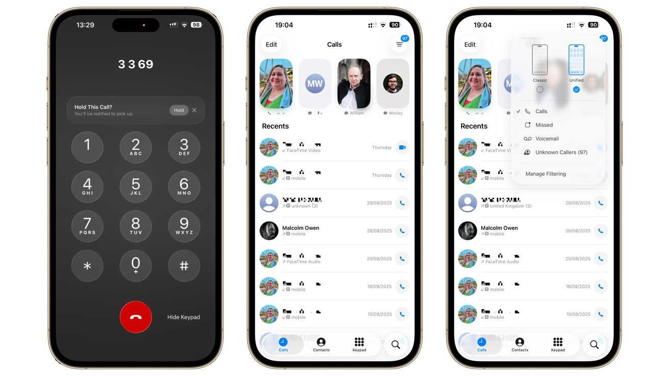
iOS 26 review: The phone calls UI ha changed, and you can even get notified if you're taken off hold during a call!
A quick tap of a list icon in the top right lets you narrow the list to call logs, missed calls, voicemails, and unknown callers. You even get a link to access filtering options in the Settings app for more control.
This includes an option to silence unknown callers. Even better, you can have your iPhone screen unknown callers by asking their reason for calling, before setting off the ringtone to alert you.
It's an extension of the already decent Live Voicemail, and a smart one at that.
For people plagued by spam calls, this is probably one of the best additions to iOS 26.
A close second is Hold Assist. If you're on a call to a call center and are trapped on hold, your iPhone will detect this and offer to put the call on hold and monitor it for changes.
As soon as a live agent rejoins the call, you're notified and can resume the call.
Even this isn't all of the changes Apple has made to phone calls.
In one of the more useful additions to Apple Intelligence, Live Translations can automatically translate what is being said in another language in real time.
It's not just limited to phone calls. In FaceTime, you can see live captions, again using onboard AI translation.
It's certainly a step in the direction of the "Star Trek" communicator, if not quite as seamless as sci-fi shows portray.
These are all additions that make the core function of a phone more useful than ever before. It's odd to say that in a world dominated by video calls and instant messaging, but it's good to still see innovation in a longstanding communication method.
iOS 26 review: Messages
The Liquid Glass changes have also permeated Messages, albeit not in a massive way. Sure, there are some tweaks, such as turning filtering options into a pop-up instead of a screen-filling page, but they are in the service of streamlining the app a little bit.
For most users, the main functionality of Messages hasn't changed, which should be a relief for avid texters.
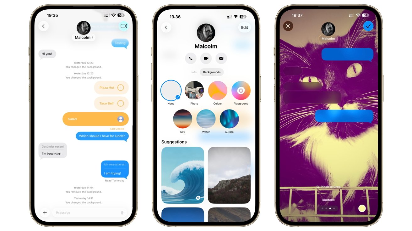
iOS 26 review: Messages adds polls, translations, and conversational backgrounds.
That said, you don't need to delve that far below the surface to see how the main changes add to the existing experience, only if you wish.
Sure, your blue bubbles are a tiny bit lighter than normal, and the horizontal bar behind the contact name is gone, so you can see more of the conversation. But more importantly, you can change the background of the thread.
This is decorative at its core, sure, but personalization of the thread is also helpful for speed. If you're smart enough to set up unique backgrounds, you can easily tell what conversation is in view when you open the app, or even from across the room.
When you're in a group conversation, the new polling option will occasionally become invaluable. Instead of having to count responses to a question in a large group or dealing with customized answers from each person, you can provide a few limited options for everyone to choose from.
Asking where everyone wants to eat has become less of a conversational nightmare.
The automatic translation is also present, which you can enable per contact. This trick at least spares you from having to copy and paste snippets into the Translate app.
The anti-spam from Phone is also present, with more options to filter your messages from view. Being able to "Filter Unknown Senders" is great for avoiding scam messages, but it's also going to add one more obstacle for occasional useful messages, such as notifications on food deliveries.
It's useful, but not quite perfect.
The changes in Messages may seem frivolous, but they're arguably just as important as those in the Phone app if you text more often than you speak.
iOS 26 review: Apple Music
Falling into a similar class of updates as Messages is Apple Music. There aren't many obvious changes aside from the introduction of Liquid Glass elements, but they are there just under the surface.
The ability to pin your favorite albums to the top of your library is a fantastic addition. Especially if you keep going to the same playlist all of the time.
Given the rise of international genres like K-pop, it's inevitable that automatic translations are also added to Apple Music. Thankfully, it's not touching the audio, but instead the lyrics.
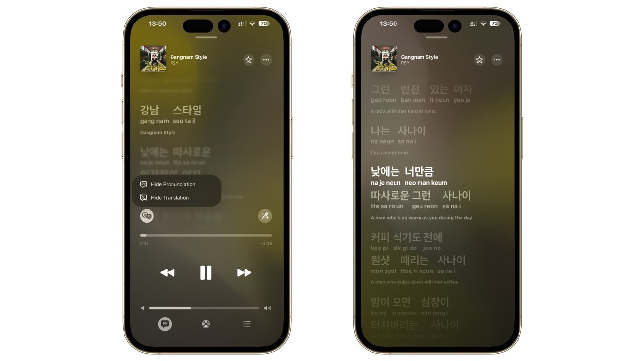
iOS 26 review: Apple Music now helps you pronounce lyrics in non-English languages, and tells you what you're singing too.
New settings when viewing the lyrics let you see pronunciation guides for scripts that don't use the same glyphs as English. Instead of being bewildered by a Korean language line in a BlackPink track, you can have a better crack at getting the sounds right.
Of course, Apple also made it so that you can see an English language translation of whatever you're saying too. Less applicable to songs like "Gangnam Style," but certainly welcomed for love songs and other ballads.
That said, it's not quite all-reaching. It's being provided in English, Japanese, Korean, Spanish, and Simplified Chinese in various combinations, and not for every song out there.
Even so, it's still a useful addition for non-Western languages.
Less successful is Apple's attempt to change how music tracks are mixed together. Everyone is familiar with Crossfade, but now you have AutoMix to contend with.
Aside from sounding like a kitchen appliance, the feature is meant to work similarly to how a human DJ at a nightclub could combine songs together. Time stretching and beat matching will overlay one track onto another.
It works well for some types of songs, like Electronica and House. Considerably less so when dealing with the long fade-outs of Classic Rock and Classical tracks.
It's a nice addition that does the job some of the time. There just needs to be more of a nudge to make it work a lot of the time.
iOS 26 review: Safari
Safari has also gone through the Liquid Glass treatment, and arguably to a much better level than you would think. The theme certainly works for the browser, all in the service of being more content-forward than usual.
The app feels like it's using more of the screen than before, in part through the use of floating glass panels instead of an entire bar covering the bottom bit of the display.
You really do get more web page to look at with these updates. When you scroll, the interface minimizes even more than usual, leaving little between you and whatever it is you're reading.
iOS 26 review: Safari's had a bit of a facelift
It's a very subtle but extremely welcome interface change. There are tweaks, such as how the Forward button isn't immediately viewable but Back remains accessible, but they are more warranted than not.
There are quite a few smaller changes to Safari that people won't necessarily notice, or even understand that they are changes at all.
Take, for example, HDR photos. While Safari 14 has supported HDR video since 2020, it's only just now started to present HDR images as vividly as the moving kind.
People who convert websites into Home Screen icons may also spot that Safari will now create webpages as web apps by default, rather than acting like a bookmark.
Similarly, SVG icon support will make the web a prettier place, but most users won't care. Developers will, however, want to use features like WebGPU to render GPU-intensive items, or even take advantage of things like the Pretty text wrap function.
These smaller changes will help make the web in general better for iPhone users in the future. Far more than floating address bars.
iOS 26 review: Games
One area that Apple has been gradually pushing more into in recent years is gaming. Aside from making Mac more game-friendly, as well as the existence of things like Apple Arcade, Apple is making mobile gaming a bit better.
Or at least, allowing people to focus on it a bit more.
The new Games app, represented by a rocket ship, isn't quite the mobile equivalent of the PC-based Steam store, but it is a gaming destination.
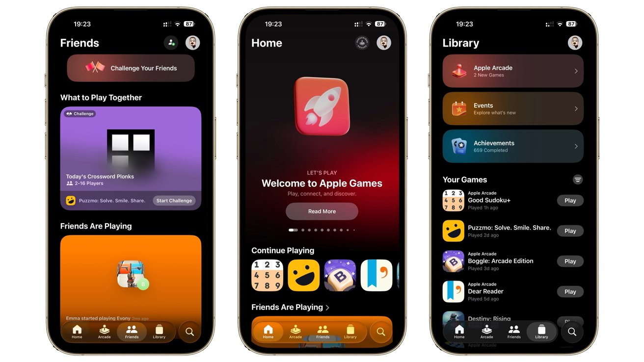
iOS 26 review: The Games app is your central point for gaming with others
If you've installed and played a game on your iPhone, you should see the title in the Games app. It's intended as a way to see what games you have available and to quickly entertain yourself.
It's not just a library for your games, nor another way to access Apple Arcade. Granted, it does serve gaming options up to users, but it does so in fun ways, such as by hinting at achievements and other things to do.
Game Center is also incorporated into the app, while Apple's multiplayer features are also hinted at by the "Play Together" section. Down the road, this could become the way that people can quickly play with friends instead of wrestling with a developer's app-specific networking system.
It may not seem it, but the Games app is a big step for a company that doesn't really "do" games.
iOS 26 review: Apple Maps
Liquid Glass may have permeated almost every area of iOS 26, but there are sections that don't feel as massively changed. Maps is one, with the alterations to how it appears being oddly minimal.
Instead, the changes are more based on utility instead of appearance.
This time around, the Library has been changed to Places. The bigger change is the option to "See where you've been," which will now log locations under the Visited Places feature.
It doesn't sound like a big change, but it is a more direct way for users to let the iPhone remember where they've been, so they can check it out later. Handy if you really want to go back to that restaurant on that street, but you can't remember what it's called.
For commuters, the new Apple Maps is also smarter when it comes to getting from point A to point B.
Using on-device intelligence, Apple Maps will now understand how you typically travel. If you're fond of driving on specific roads near your home or work, they will be taken into account when you're using the navigation system.
It's also a bit smarter when it comes to monitoring those routes and alerting you to any delays. This is something Google Maps presents well, so seeing Apple try to compete in Maps will help make it more useful for commuters at least.
iOS 26 review: Apple Intelligence and Visual Intelligence
Apple Intelligence continues to be a blessing and a curse for Apple. The botched and slow rollout as part of iOS 18 is something it has to work against for this generation.
That low point does actually work in its favor, though, as it lowers the expectations for this time around.
As detailed earlier in this article, there are quite a lot of translation changes, both in calls and in music. For the most part, this is the main high point of Apple Intelligence this time around.
There are other changes, such as additional ChatGPT styles added to Image Playground and Genmoji tweaks. If you're into automation, there are a lot of hooks into Apple Intelligence to make Shortcuts work a lot better.
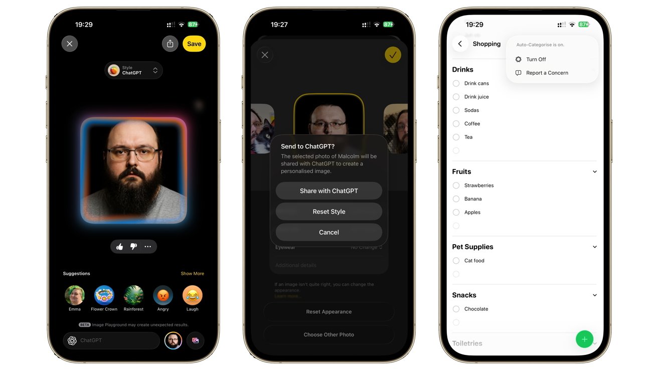
iOS 26 review: ChatGPT plays nice with Image Playground, while Apple Intelligence can categorize your lists.
We may even see more of this in the future, since Apple says it will be providing developers with access to those same on-device processing capabilities at some point.
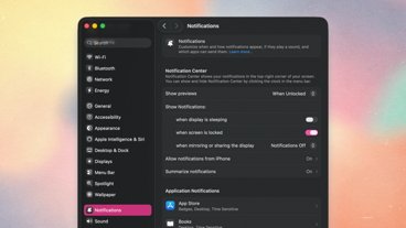
There are other small improvements, such as Reminders including auto-categorization of lists. The revival of Notification Summaries for news apps following the complaints is also a good inclusion, if more tentatively dealt with this time around.
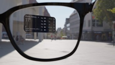
Another bigger change is that Visual Intelligence is doing considerably more with screenshots. Rather than relying on what your camera can see, you can now ask more of Visual Intelligence for whatever is appearing on your iPhone's screen.
This is a much quieter change than you would expect, as again it is something that can impact how you use the iPhone in the future.
It's one thing to make calendar events based on a screenshot of a social media post. It's another if you imagine how the same system could be used by apps or even a future Siri update to control other apps on your device.
Sadly, Siri is still the big issue with Apple Intelligence.
We were promised a more context-aware Siri that could do a lot more with our personal data and our digital lives back in iOS 18. A year later, and we're still waiting for it.
Apple has certainly admitted that it has screwed up where Siri is concerned, and it is evident to see that it is still working on making it a reality. We just don't know when that will be.
For all of the improvements Apple makes in the name of Apple Intelligence, the lack of that Siri upgrade is arguably the most damaging to the initiative.
Apple hasn't made a song and dance about Siri this time around. It's learned its lesson, but its absence is felt.
iOS 26 review: Capable, glossy, but overshadowed
If we were to compare iOS 26 to a non-Apple Intelligence iOS update in the past, we could certainly call it a great package.
A user interface update that not only refreshes the operating system but also prompts changes to first-party apps that are improvements in their own right. One that also extends the personalization options that were implemented in the previous milestone release.
There are many other smaller changes that could be included in the assessment, such as Journal supporting multiple journals, or the boarding pass and digital ID changes in Wallet. Even the ability to customize the Clock's zoom durations is a great change.
If we include the Apple Intelligence changes, including how calls and messages are handled and live translations, it all adds up to an update that should be considered one of Apple's better ones in recent years.
Even so, there is still the Siri situation to contend with. It's hard to appreciate the changes when you know that it could've been better had Apple actually managed to get the Siri update out the door.
Much like the iOS 18 release wasn't really "done" because we had to wait for the much-hyped Apple Intelligence to start its rollout later in iOS 18.1, it's a similar feeling here.
Overall, iOS 26 is a great update for most users. It's the wait for Siri that dampens the spirit.
iOS 26 review: Pros
- Liquid Glass works very well as a UI
- App updates are clean and useful
- Call and message functions are big usability upgrades
- Live translations in multiple forms
iOS 26 review: Cons
- Siri delays spoil the party
- Apple Music's AutoMix can do with some work