Hot on the heels of a report describing the buttonless interface on the "iPhone 8," designers and developers have begun circulating media hinting at what it might look like in practice.
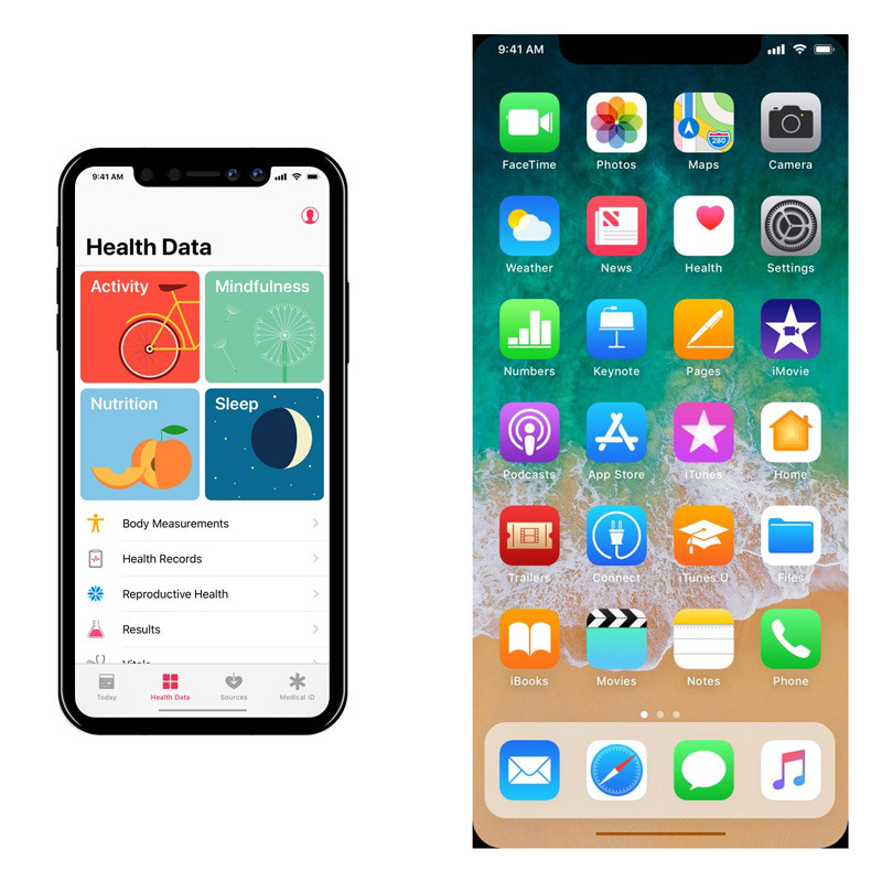
Mockups by French designer Olivier Charavel show not just Bloomberg's reported split status bar — accommodating the "iPhone 8's" sensor notch — but the "thin software bar" said to be towards the bottom. Users will allegedly have to drag this upwards to unlock the phone or launch multitasking.
A Charavel image and a short video by Brazilian developer Guilherme Rambo picture iOS 11's iPad dock transposed onto the iPhone. A similar dock is expected on the "iPhone 8," if modified to fit the dimensions of a smaller screen.
This is what the floating dock looks like on an iPhone pic.twitter.com/BbKVIL7yO8
— Guilherme Rambo (@_inside) August 30, 2017
The "iPhone 8" is generally rumored to have a 5.8-inch, edge-to-edge OLED display, jettisoning the physical home button found on every previous iPhone. While offering some benefits, Apple is thought to be using a mix of new interface tropes and 3D facial recognition to get around limitations, such as a lack of Touch ID.
A press event is likely set for Sept. 12.
 Roger Fingas







 Malcolm Owen
 Mike Wuerthele

 Christine McKee

 Charles Martin

 Marko Zivkovic


-m.jpg)

11 Comments
1) That mockup is missing many useful icons, like Bluetooth enabled, BT headphones being connected, VPN, and location services in use.
It's also missing the battery percentage, but at least that one could replace the icon if space was really an issue. I also don't think that the carrier name is that important, but I have to think that it will remain if it's been there for decade—especially if we're moving to an eSIM where you can quickly change the carrier at will without having to shuffle physical SIM cards.
2) If it's a touchscreen couldn't Apple make the status bar touch sensitive so that tapping it will switch to a different view? For example, perhaps on the first status bar screen you have your cellular bars + carrier on the left side with time and battery life on the right side, then on the second status bar screen you have WiFI + VPN on the left side with location, BT, and BT headphone connectivity on the right side.
Perhaps even a Settings option for those that want a larger status bar to show all of these features at once. I think that's unlikely, but even more unlikely is a scroll of all these icons as that seems distracting and unpleasant, to me.
From the video mockup posted on Twitter: I do not see Control Center. I thought popular rumor has it that Control Center on iPhone will be including in App Switcher, like with iPad on iOS 11.
Apple are missing a golden opportunity to do a Samsung on it. Going home is as simple as a right-wink. Multitasking is a double-right-wink. And Siri is an extended-right wink. Pro level keyboard shortcut equivalents will be reserved for left winks and then there’s the up-and-coming whippersnappers and their advanced-eyebrow-typing. lol