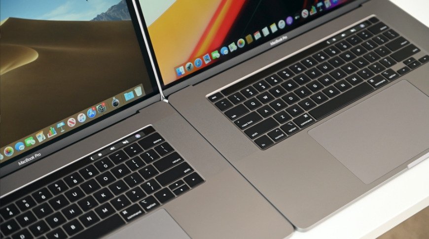
Apple could replace the Touch Bar in the inbound MacBook Pro refresh with a row of full-size function keys, a rumor based on schematics leaked in April claims.
Multiple rumors have floated throughout 2021 that Apple intends to remove the Touch Bar from the 14-inch MacBook Pro and the 16-inch MacBook Pro. While rumors ahead of Monday's event have covered the elimination of the keyboard element, there has been little chatter about what will replace it.
On Monday, an examination of schematics stolen from Apple supplier Quanta Computer in April offers a hint that it could be quite a simple change. It is thought that Apple could be reintroducing a row of full-size function keys to the MacBook Pro keyboard once again.
The schematics, acquired by the ransomware gang REvil and reexamined by MacRumors, illustrate the keyboard as having a full-size row of keys at the top of the keyboard, one that occupied space where the Touch Bar resided.
The change to a full-size key set could be considered an improvement on the function keys Apple used in pre-Touch Bar MacBook Pro models, which instead used half-height keys for the task.
Though removing the Touch Bar may also take away a component used for Touch ID, it's possible that Apple could use the same key design it used in the 24-inch iMac keyboard to include a fingerprint reader.
![A concept render based on the schematic, showing full-size function keys. [Image Source: Front Page Tech]](https://photos5.appleinsider.com/gallery/45088-87680-41919-81311-BD73C476-3C4C-47CA-83B2-D479D415914D-xl-xl.jpg)
A concept render based on the schematic, showing full-size function keys. [Image Source: Front Page Tech]
Oddly, this is not the first time someone has hinted at the Touch Bar's removal. Renders commissioned by leaker Jon Prosser in May reused the 24-inch iMac keyboard as a stand-in for a concept MacBook Air, a suggestion that wasn't considered as a major change to the notebook.
A closer look at the leaked schematics was prompted by late rumors about the MacBook Pro lineup, including one claiming a notch will be used in the display, though not necessarily one that will include Face ID support. The schematics also pointed to possible additional ports, such as HDMI and an SD card reader, though recent reports indicate Apple pulled away from their inclusion.
